As I look into designing the title for my project, I was asked to rethink as the initial design I had was going towards the whimsical road.
 |
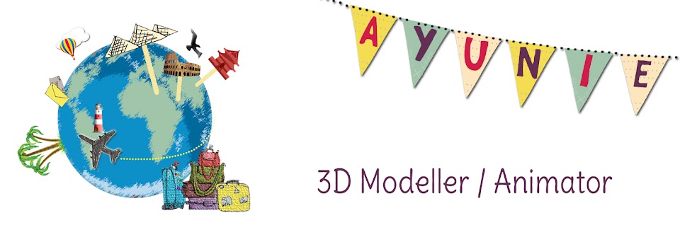
| Initial Design |
Below are two designs. They are unfinished but I am going towards the mischievous, playful look. I think design 1 works better.
 |
| Redesign 01 |
 |
| Redesign 02 |
Hi Ayunie - No 2 is more like it - but you haven't really stylised your world as strongly as some of the bird/flower elements you've included, so they look as if they've come in from a different project altogether. Go and get some more alternate typefaces and put some more variants together, and avoid adding anything additional until you've identified the perfect fit. It does feel to me as if something 'handwritten' (as if scribbled by the woman herself) makes the most sense.
ReplyDelete