
For my digital set, I've gone to texture the bookshelf, added a glass texture to my window surface and shadows to the scene.
Currently, the glass seems to be too reflective and it looks more like a mirror. I am correcting that and in terms of the overall lighting, I am quite satisfied with it.
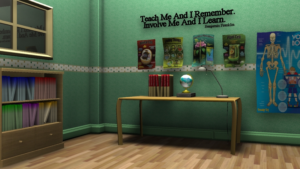
It's much better, Ayunie - but do you think your posters are maybe too rumpled now? So much so that they actually look as if they're floating off the wall? My original comment was as much about too neat way they were spaced, and in a perfect line; I think it would still help your scene if one or two of those posters were slightly larger than the others? So, yes, just calm them down a bit in terms of their floatiness - and also, I reckon your skirting board should be white or cream, because it's more normal that skirting boards are a different colour to the walls... I know, picky, but true!
ReplyDeletePoint noted Phil. Thank you :) Yea, I find that they're floating too, Was trying to do some kind or corner pins so it will look like it's not floating, but wasn't successful. Will work on it further :)
Delete